Welcome

My name is Lisa and I'm a crafty girl with wanderlust working as an engineer by day. My blog chronicles projects in my home as well as pictures and stories from my travels.

Search


Instagram

Blog Index
The journal that this archive was targeting has been deleted. Please update your configuration.
Navigation

Entries in Before & After (12)

Friday
Sep142012

Master Bathroom Renovation Recap 

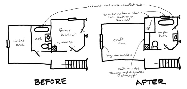
I realized that although I had finished up my master bathroom I had never put together an overall post with pictures from around the whole room. I thought I'd start by sharing the floor plan in the back portion of the upstairs when I bought the house and what I revamped it to.

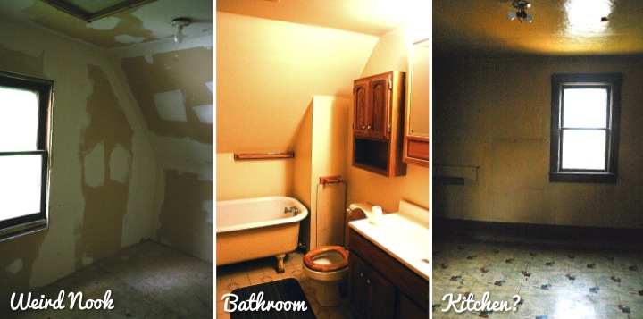
The previous owners had taken the 13-1/2' x 13-1/2' room in the back and carved out a 5' x 8' space to create a bathroom. It left a really weird nook in the rest of the space that they had drywalled but never finished. The whole thing was quite strange. The room next door was a nice size at 10' x 10' (with a little angle cut off the corner) and seemed to be used as a kitchen at some point based on pipes sticking out of the wall and some teacup wallpaper in the closet. It seemed to me that a better use of the space was to make the old kitchen room into a master bathroom which would then leave a large space in the back room for me to make a craft room.

I spent a lot of time trying to figure out how to layout the new bathroom. The window was off center in the room so by placing my shower in the corner I was able to make the window look like it was centered on the wall. Most of the old bathroom was unsalveagable but I saved the old claw foot tub and placed it under the window. In one corner of the bathroom was a bump out for the old chimney. In order to make it less pronounced looking and give myself some storage I decided to put a built in in the space between the chimney and shower. I kept the door locations the same and from there it was easy to determine the location for the toilet and sink.
Here a few pictures of the space before. Yeah, I know that it looked like a scary old haunted house and I am crazy to have bought the place. Looking back at the old pictures encourages me because it reminds me how far my house has come even though there is a lot more left to do.
Okay, now for the fun part, the after pictures. The room was gutted to the studs with new electrical, HVAC and plumbing. Putting the room back together the bathroom was drywalled and new trim was installed including beadboard wainscoting around the room. The old linoleum was torn out and the floors were refinished. Those major renovations required me to hire some professionals for some things as well as get the helping hand of a friend for some others.

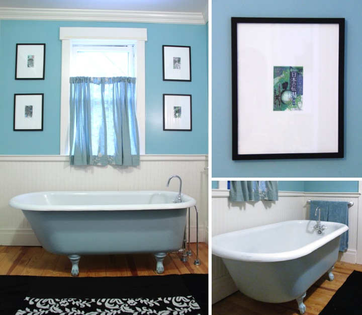
For a color scheme I thought teal and white with a few hints of black would be bright and refreshing. Since my house is over a hundred years old I wanted to keep a vintage feel to my bathroom. Also, since I lived in Japan and really enjoyed their strong culture around bathing (i.e. going to hot springs (onsen) for bathing, taking regular soaking baths at home) I included some small Japanese touches in my bathroom's decorative accents as well.

My clawfoot bathtub was salvaged from the old bathroom and while the porcelain on the inside was in great shape the outside paint was beige and chipping off. I refinished the outside with a pale teal paint and then added a new vintage style chrome faucet with white handles. On the floor in front of the bathtub I made a rug by sewing together some towels. On the walls flanking the window, I framed some pretty decorative packaging from Japanese bath salts.
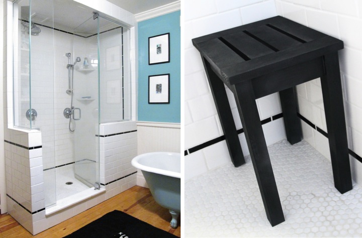
I made the shower 3 feet by 5 feet which was spacious enough for two shower heads. I also wanted it to be open so I designed it to have the knee walls with clear glass above and splurged to have custom glass installed (I think it was worth it!). With all the space in the shower I decided to build myself a little shower stool to fit in the corner.

This was my very first experience in tiling and being an engineer I was pretty anal retentive about the way I lined up the tile and wrapped the pattern around the corners. I bought a used wet tile saw from a guy off of Craig's List for $100 and it was worth every penny! I chose 3" x 6" white field tile to give a vintage subway tile look plus as an added bonus it was inexpensive. For my accent liner bars I thought that black tile was a good neutral choice so that it left me free to change up the colors in the bathroom in the future without worrying about the tile color.
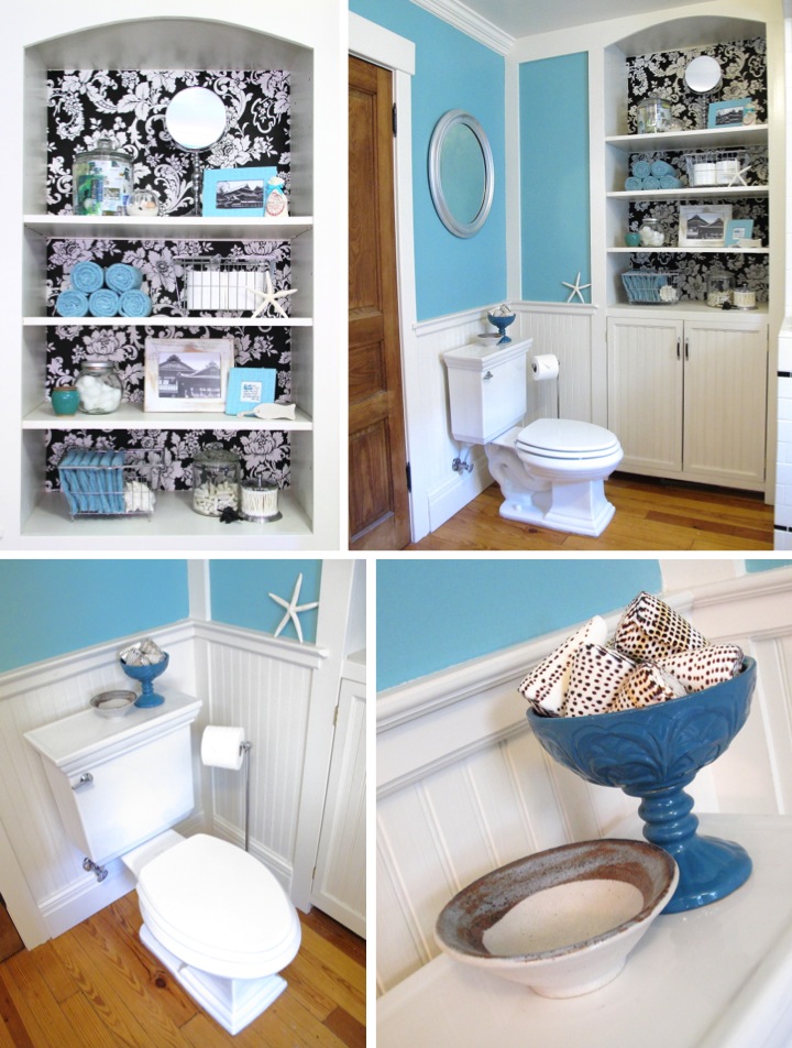
My built-in is one of my favorite parts of the room. I designed it to have open storage up top as well as some concealed storage down low. For fun I added some black and white damask patterned wallpaper to the back of the top of the built-in. I had a lot of fun arranging the shelves with practical bath items, like towels and my Japanese bath salts, and decorative items, like white coral that I picked up on a beach in the USVI and framed pictures that I took of a famous Japanese onsen. 

Above the toilet I made over a free mirror with some silver spray paint to tie in with the chrome fixtures in the room. On the back of the toilet I have displayed a little white bowl that I made at a pottery studio in Seto, a town famous in Japan for pottery. Seeing it every day brings back some good memories. Since space was tight and I didn't want to add holes to my beadboard, I chose to use a free standing toilet paper holder.
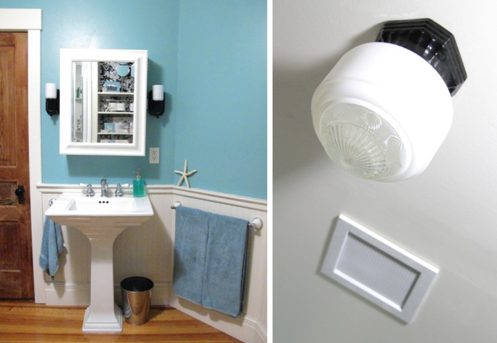
Since I had plenty of storage in the built-in I chose a pedestal sink to keep the bathroom looking open as well as maintain the vintage feel. Like the shower and tub, the new fixtures are chrome with white handles in a vintage style. I thought about building my own medicine cabinet, but then found this one at the Pottery Barn Outlet for such a great deal that I couldn't resist.

For lighting I bought a pair of black porcelain sconces that are vintage reproductions. I have a matching black porcelain ceiling fixture that I paired with a vintage glass globe that I found on eBay. I love how the globe is white on the sides and has the detailed deco pattern in the clear glass on the bottom. My ceiling fan came with a plastic vent cover that I felt didn't go with the look of the bathroom so I built my own vent cover out of wood and some perforated metal.
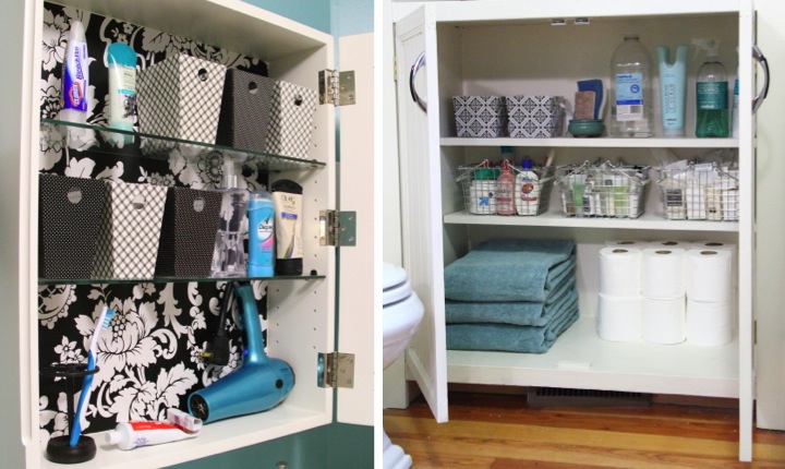
Inside my medicine cabinet I added some more wallpaper and then organized by using some inexpensive black and white cardboard containers. The bottom of my built-in was organized with some more cardboard containers and wire baskets. By nature I am not an organized person (some days Pigpen has nothing on me) and the little containers really help me to corral things and have some semblance of order. These shelves are by far the neatest area in my house right now. I really wish I was kidding but unfortunately I am not. 
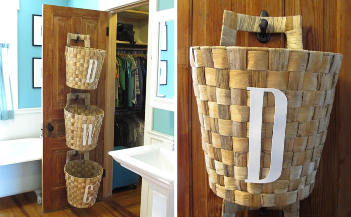
On the back of the door next to the sink (which leads to my master bedroom closet and then on to my master bedroom) I hung up and labeled baskets to sort my laundry. This has really me to keep my piles of laundry off the floor. Now when a basket is full I can just take it off the hook and down to my laundry room.
Well, there you have it, more detail than you would ever want to know about my bathroom. It has been a lot of work but I really love it and I wouldn't want to change a thing (for now that is!).

If you are curious, here is a list of sources for the room. As a disclaimer I started remodeling it back when I bought my house and many of the decorative/storage items I have had for years and years so some items are discontinued and there are a few things I where I just don't remember.

Wall Paint: Valspar Lyndhurst Duchess Blue
Trim Paint: Valspar Betsy's Linen
Bathtub Paint: Valspar Beach House
Ceiling Light Fixture: Rejuvenation Mathison Streamline Porcelain Ceiling Fixture
Ceiling Light Shade: Vintage from eBay
Sconces: Rejuvenation Adrian Streamline Wall Bracket
Shower Door: Custom by Wolverine and Moore Glass
White Shower Wall Tile: American Olean 3-in x 6-in Starting Line White Gloss Ceramic Wall Tile
Black Shower Tile: American Olean 1-in x 6-in Linea Gloss Black Ceramic Tile Liner
Shower Floor Tile: The Tile Shop Hex Matte White .75 x .75 in
Pedestal Sink: Kohler Memoirs (Base Link)
Toilet: Kohler Memoirs
Medicine Cabinet: Pottery Barn Sonoma Wall Mounted Medicine Cabinet (purchased at Pottery Barn Outlet)
Built-in Cabinet Handles: Lewis Dolin Retro Pull
Wallpaper: Norwall Black & White BK32032
Black & White Cardboard Bins: Target One Spot
Wire Baskets: Target
White Reclaimed Wood Picture Frame: Mulbury Gallery (purchased at an art fair in Australia)
Teal Leather Picture Frames: Papyrus
Black Wall Frames: Meijer
Toilet Paper Holder, Cotton Swab Container, Stand Mirror: HomeGoods
Soap Dispenser: Target
Large Starfish: Michael's
Towels: Target Room Essentials
Rug: Made from HomeGoods Towels 
Laundry Baskets: Ikea Nasum

Friday
Jul132012

Dining Room Then & Now 

Somedays I get overwhelmed with all of the things I need to finish up around my home. Since I got my new dining room chairs a few weeks ago I keep thinking about all the things left that still I want to do in there like get a larger table, make curtains, change the paint color, add some wall art and replace the buffet with a built-in. The list just goes on and on. Don't even get me started on other rooms in the house.

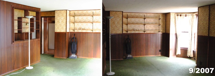
When I start to get discouraged it helps for me to reflect on how far I've come. When I first bought my house in September 2007 the dining area, like the rest of the house, was a nasty wreck. The floor was covered in green threadbare carpet riddled with stains. The crumbling plaster lathe walls original to the house had been covered up with faux wood paneling and wallpaper instead of being repaired. Likewise the crumbling ceiling had been hidden by a cardboard tile drop ceiling. The previous owners had been heavy smokers and everything reeked and was full of nicotine stains. The wallpaper which looked like it was yellow was discovered to be originally white based on the areas that had been hidden under the paneling. The whole place was in one word gross and everything needed to go.

After gutting everything to the studs, the situation got worse. Building practices in the late 1800s don't always meet modern building code. It turns out that the ceiling joists over the dining room and living room were huge beams about 8" x 8" spaced 48" apart. That is not anywhere even remotely up to code and so I ended up having to have the beams sistered with steel C-channel to give the proper support for the second floor load. On the bright side I discovered that the hardwood floor hiding under the carpet was in good enough shape to be saved.

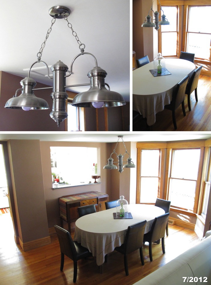
With this part of the house in complete remodel I took the opportunity to rework the floor plan as well. Upon walking in the house a long wall created a strange hallway parallel to the dining room and living room. I had that pulled down which required moving some ductwork and electrical and enlarging the chase next to the bay window.  That really opened up the first floor, but the biggest change came from making a pass through into the kitchen. I love that I can see through to the back window of my house from my front door and the pass through is great for entertaining. Opening things up also made the bay window a focal point on the first floor instead of being hidden away.

With the structural changes done the walls were drywalled and painted and the hardwood floors were refinished. The original trim was too badly damaged to be reused but new trim to match the original profiles was put up around the windows and for the baseboards. My favorite part of the dining room remodel is the Hi-Lite two-light island pendant that I got on sale for $200. It has a beautiful finish and the price was a fraction of other similar fixtures.

Standing back and looking at the room as it is now, I still see the laundry list of items I want to complete to finish the space and give it some personality. But it is good for me to stop and take a moment to remember how far it has come and that the hard part is behind me.

Monday
Jul022012

Living Room Side Table Makeover

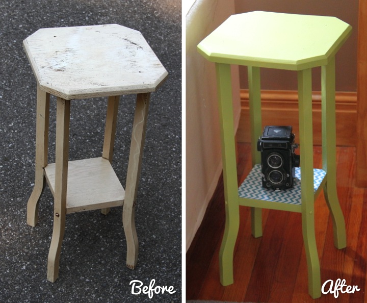
On Saturday I dropped off two donation boxes at the Ann Arbor ReUse Center full of household goods that I had purged from my home. While I was there I couldn't resist looking around a bit and I picked up a cute but very battered little end table for $5.

I have wanted a table to go on the end of my love seat in my living room for a while, but I needed something with a small footprint since I don't have much space. I think the little table I found was meant to be a plant stand but it is just the right size for my purposes. The height is great and now I have a spot for guests to place a drink when I am entertaining at my home.

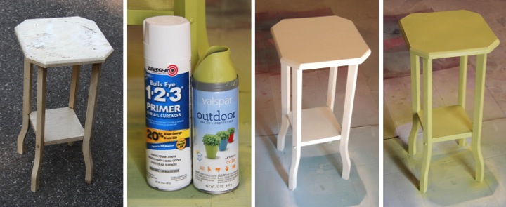
The table was sturdy and the wood was in good shape, but the cream paint finish was grungy and quite poorly applied. I cleaned up the table and gave it a coat of spray primer followed by two light coats of spray paint in Spring Sprout.

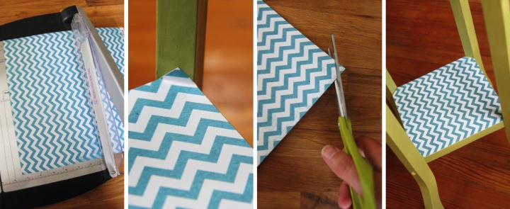
Once I let the table dry for a day I decided to add some paper to the bottom shelf for fun. I measured the shelf and then cut a piece of teal chevron scrapbook paper down to a square of the right size. The shelf attaches to the legs at an angle so I needed to trim off the corners to make the paper fit. I placed the paper on the shelf and then folded the paper up where it hit the leg. This gave me a guideline for trimming the corners and ensured a perfect fit.

I think that the table turned out really cute and I can't beat the price of less than $11 ($5 table + $4.98 spray paint + $0.89 paper). It looks really bright and cheerful now.

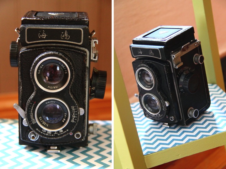
The table fits wonderfully next to my love seat. I thought that the little shelf would be the perfect place to display the vintage camera that I picked up at a little flea market in Shanghai, China. It isn't in working order but when I saw it I couldn't resist buying it, loving taking photos as much as I do. My favorite part about it is that it actually has markings on it indicating that it was manufactured in Shanghai. 

Have you made over anything recently? Are you up to any spray painting? I think I must spray paint something once a week. It's a compulsion I tell you!

This post is linked to the "Thrift It Challenge" on Our Fifth House.

Monday
Jun042012

New Mailbox

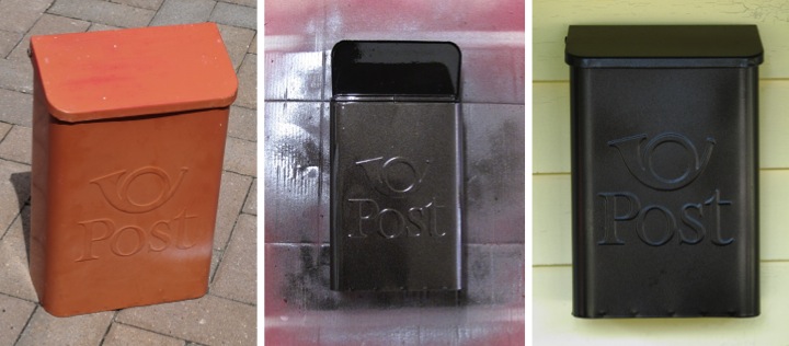
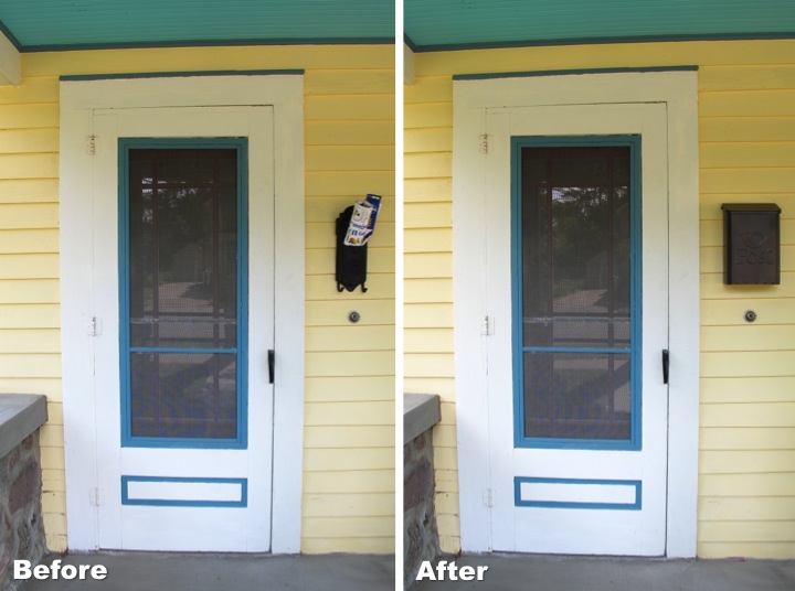
When I bought my home I quickly ditched the 1970s style mailbox and replaced it with a vintage cast iron one that I found on eBay. I love the style of it, but unfortunately it is a little small for modern mail so I have been looking for something else. 

Finding a vintage metal mailbox that is larger than what I had was actually pretty difficult. Finally I found on eBay a burnt orange mailbox that was plenty big to fit my mail. I scooped it up for $9.99, gave it a thorough cleaning and refinished it with a few thin coats of oil rubbed bronze spray paint.

I have to say that I like the charm of my old cast iron mailbox better, but it wasn't worth having my mail all bunched up and bent. The new mailbox is still cute and I can now recieve my mail flat. I'll have to think of something fun to do with my old mailbox now.

What do you think? Have you ever had any too small mailbox issues?

Monday
May212012

Folding Luggage Stand Makeover for My Guest Room

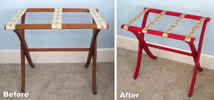
As I was cleaning out my garage on Saturday I rediscovered an old folding luggage stand that I had picked up for a few dollars several years back. It was in nice shape but the color of the wood and the ribbon wouldn't fit in with the style of my guest room so I decided to give it a little makeover.

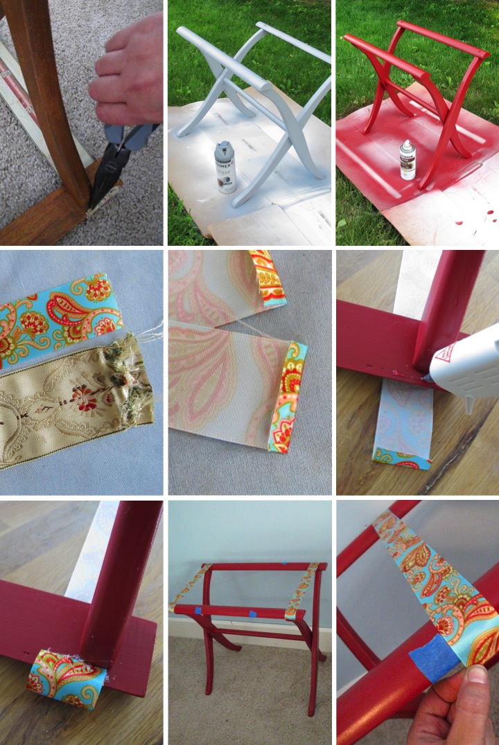
I started by using a needle nose pliers to remove all of the staples that held the ribbon onto the stand. With the ribbons removed I gave the wood stand a good cleaning followed by a light sanding. I then primed it with a grey spray paint primer followed by some light coats of red spray paint. Whenever I am using deeper colors I get better results if I use grey primer instead of white.

After the stand was dry it was time to add the new ribbons. Using the old ribbon as a pattern I cut new ribbons to length and then ironed under 1/4" on each end. Because my old ribbon was 2" wide and my new ribbon was only 1-1/2" I decided to increase the number of ribbons to four.

I started attaching the ribbons by working on the ends. I flipped the stand upside down on top of the ribbons and used a glue gun to glue them to the underside of the stand. For the middle two ribbons I wanted to make sure everything was taut so I stood the stand right side up to attach them. I measured out where they should be placed and marked the spots with blue painters tape and then glued them in place.

I had picked up the stand a few years back and already had the spray paint and primer so my total cost for the project was $3.50 for the spool of ribbon. Not counting paint drying time it took me about forty-five minutes of hands on time to complete the makeover.

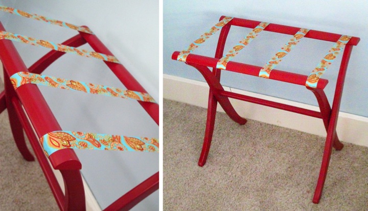
The new version of the stand is very bright and cheery and a nice improvement over the way it used to look. I think it will make a fun and useful addition to my guest room.

Tuesday
May012012

Replacing Outlets

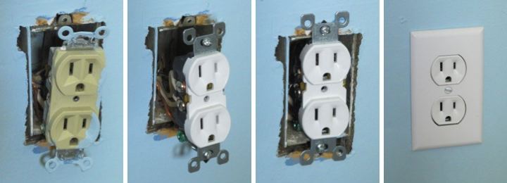
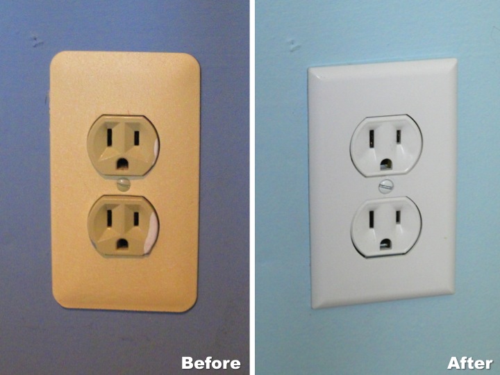
After I repainted my guest room on Saturday I decided that something needed to be done about the old, ugly outlets in the room. They were a yucky tan color with metal cover plates and just looked dirty and old. Since I already had the covers off due to painting I figured it was an opportune time to replace them.

Replacing an outlet is really simple, but due to the fact I don't want anyone to hurt themselves by misunderstanding what I might write, I'll let you look it up from professionals instead of giving the details here. I will say one thing, however. The most important thing is to make sure that you kill the power before you start. I am a little paranoid so I cut the power with my house's main circuit breaker instead of just the circuit I am working on. No shocks for me, thank you very much!

It took me about five minutes to swap out each outlet with a new white outlet and a new white cover plate. It is just a little detail but I think it definitely helps make the room look cleaner and more updated.

Monday
Apr302012

Turning a Chest into a Console Table

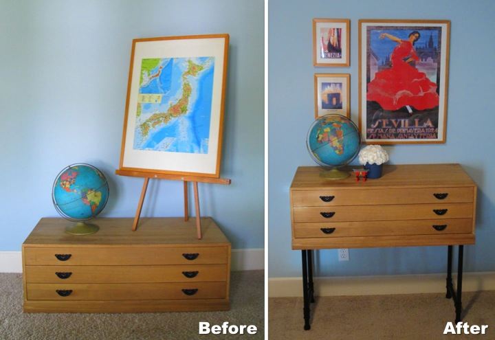
I love the little tansu chest that I bought for my apartment while I was living in Japan, but at only 14" high it has been hard to incorporate into my home in the U.S. without it looking like a piece of doll furniture.

To solve my problem I decided to try to turn it into a console table. I wasn't able to find wood with the fine grain to match the chest for legs so I decided to match the black metal pulls instead.

While I was trying to figure out what to do I remembered seeing a DIY Industrial Cart on Ana White's site that used pipes between the shelves which inspired me to use pipes for the legs. 

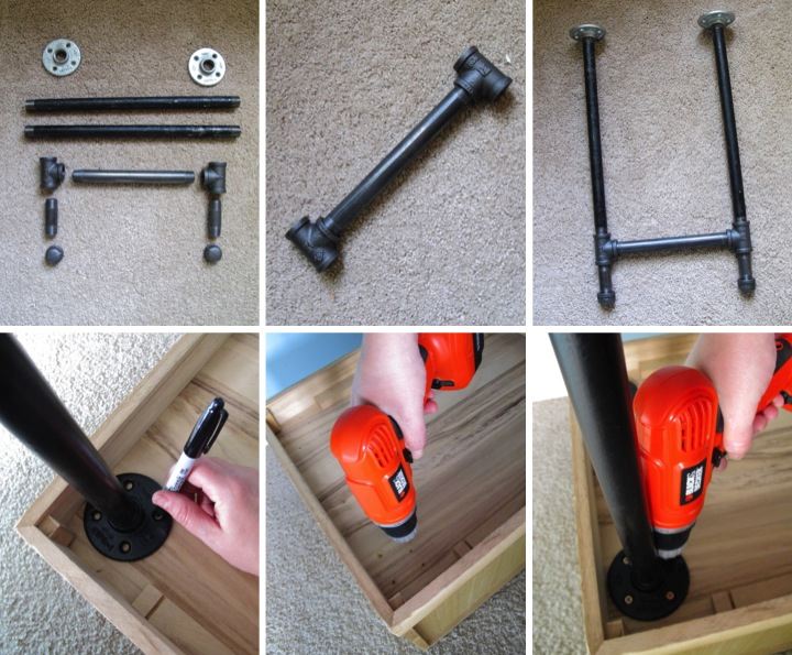
I chose to use 3/4" black pipe which I thought would be sturdy enough to support my light chest. To start I threaded two tees onto each end of a 10" nipple. On the bottom of each tee I threaded a 3" nipple followed by an end cap. On the top of each tee I threaded an 18" pipe topped by a flange. I repeated the same process for the second set of legs.

Once I had the legs assembled I gave them a coat of tinted primer followed by two coats of matte black spray paint. After they were thoroughly dried I flipped my chest upside down and lined up the legs where I wanted them to be on the bottom of the chest. I marked where the flange holes would be and then pre-drilled holes for my screws. I then put the legs back on the chest and screwed them on to complete the transformation into a console table.

Comparing how short and out of place the tansu chest looked before, to how it has now become a piece of featured furniture in my guest room makes me really happy. I think elevating the chest has made a world of difference. The legs are quite sturdy and as an added bonus with the chest raised up I now have easy access to the outlet on the wall which was previously hidden.

After the console table was done I had a bit of fun decorating. I picked up the Sevilla, Venezia and Paris prints and poster during my travels and framed them in Ikea Ribba Frames. I have had the tin globe for several years and actually used for the photo in my banner. The tiny red torii gate is a souvenir that I bought while visiting Miyajima in Japan. I finished my display off by arranging a bouquet of carnations in a little blue pot. 

With this transformation I have one little corner of my guest room feeling cozy and welcoming. Now I need to get on doing something about the ugly bi-fold doors on the closet and making a headboard.

Wednesday
Apr252012

Spray Paint Makeover & Japanese Pottery Fun in Seto

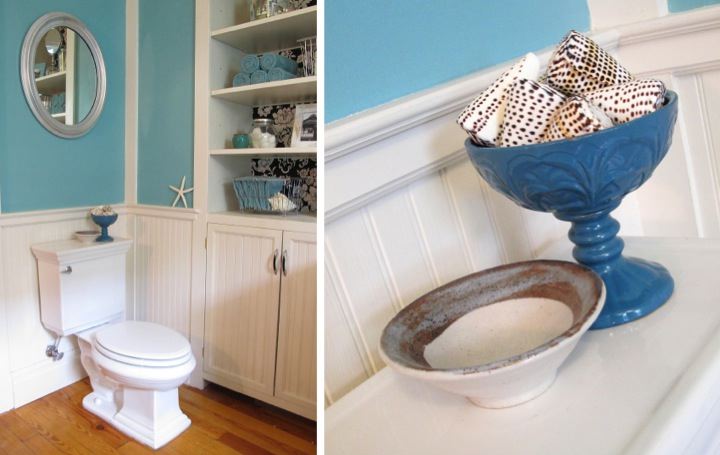
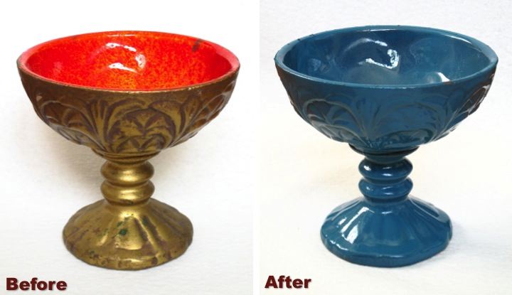
I've been trying to find just the right thing to put on the back of my toilet in my bathroom since it looks a little empty and plain. When I spotted this little chalice for two dollars at the Ann Arbor Reuse Center I knew it was a diamond in the rough.

The gold paint with the speckled red finish on the interior was absolutely hideous, but it had a cute shape and with a few coats of teal spray paint it was the perfect vessel to house a few shells and sit on the back of my toilet. I never stop being amazed at the power of a little spray paint. 

As a fun aside, I made the little bowl sitting next to the chalice when I was living in Japan. Not too far away from where I lived is a small town called, Seto, which has been famous for its pottery for centuries. In fact the generic word for ceramics in Japanese is setomono (瀬戸物) which literally means Seto objects. I signed up with my friend, Trisha, to go to one of the pottery studios, Kasen, to learn about traditional pottery in Seto and try our hand at making some of our own pieces.  

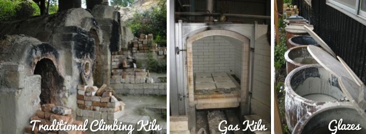
The owner of the studio, Hiroshige Kato, is a twelfth generation potter using clay from the same place as his forefathers 400 years ago. He showed us the spot where he digs for clay as well as how his kilns work and the traditional glazes used in Seto.

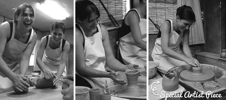
Back inside the studio Kato-sensei taught us how to knead the clay and then form bowls and plates on the potter's wheel. After the introduction we had an hour to play around making our on creations. Trisha was a little overly ambitious on the wheel and when her clay got a little off center had a few bowl collapses. She decided to keep one of her collapsed pieces anyway deeming it art and as a result Kato-sensei started calling her "Special Artist." Trisha decided the nickname was a badge of honor and we had lots of fun joking about it.

The whole experience was an awesome time and a really great deal, too. The cost was ¥2000 (about $20 at the time) for the class and then ¥500 (about $5 at the time) for each piece that you decided you wanted to have fired. In the end I decided to have seven of my bowls fired and picked out different glazes for them. After a few weeks the bowls were available to pick up at the studio. I love having my pieces around my home because in addition to being pretty they remind of the fun time Trisha and I had making them.

If you ever find yourself in Aichi prefecture in Japan I would highly recommend arranging to take a class at Kasen. The price structure is a little different than when I did it and the exchange rate has also changed, but it is still very reasonable and it is a really great chance to have a hands on experience making Japanese pottery.

Have you recently spray painted anything totransform it? Have you ever tried your hand at throwing pots? Did it turn out well or did you make some "Special Artist" pieces? 

Tuesday
Mar062012

Before & After: Cookbook Stand

I love cookbooks. I have a ton of them and I enjoy flipping through them for inspiration. Some of the cookbooks that I have had forever naturally fall open at my go to recipes and a stranger looking through them would be able to spot my favorites by the amount of splatters on the page.

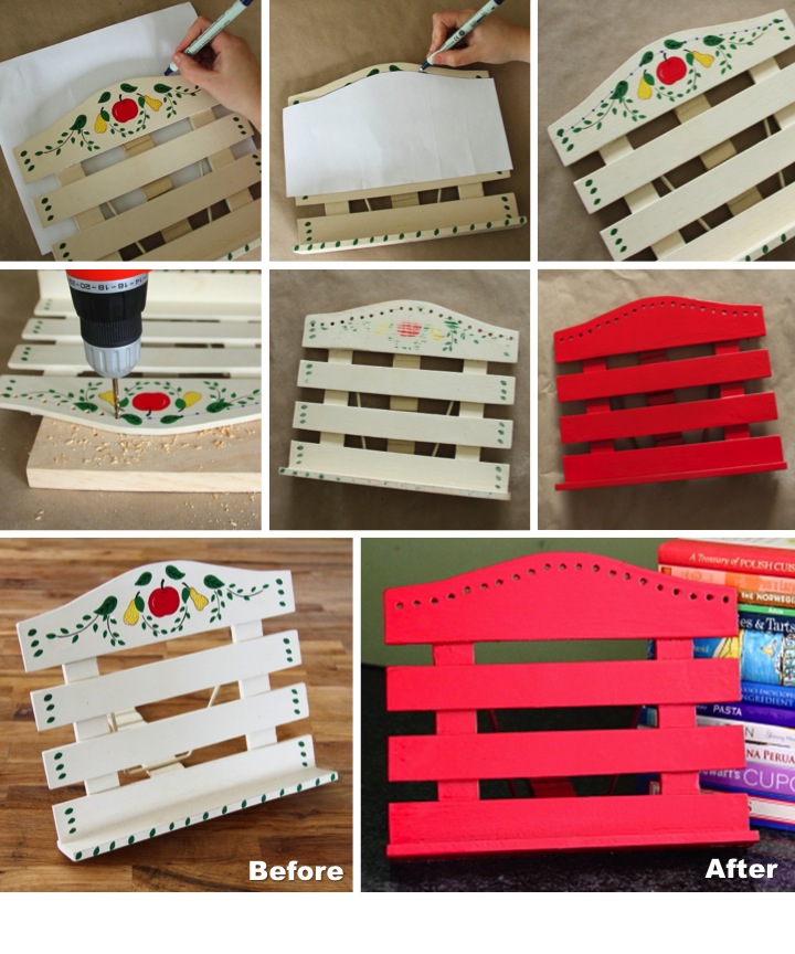
I have been meaning to make myself a cookbook stand in the hopes it would keep my cookbooks a little cleaner and out of the way when I am using them. When I found this little white cookbook stand with decorative painting for fifty cents at the Ann Arbor ReUse Center on Sunday I thought it would be an easier alternative to just buy it and give it a little make over.

The fruit design was a little to cutesy for me  and the finish looked worn and shabby so I thought a fresh coat of paint would spruce it up. First, I thought I'd add a little extra interest to it by adding a top border of drilled holes. I wanted to follow the curve of the top piece of wood so I traced it on a piece of paper and cut it out for a pattern. I then lined it up about 3/4" below the top of the wood and traced the line. I marked my drill holes along the line every 1/2" starting from the center. To protect my work surface I put a piece of scrap wood under the cookbook stand to drill into.

After I finished making my decorative holes I sanded the piece smooth (the previous decorative painting was a bit raised) and then wiped it down to remove and sanding dust. I used a grey spray paint primer and then finished it off with two coats of red spray paint.

I like how the cookbook stand turned out and this was way cheaper and faster than building something from scratch myself. Now I'll just have to start using it to see if keeps things a little tidier when I am cooking...


Tuesday
Feb282012

DIY Bathroom Fan Vent Cover

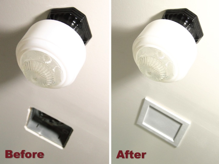
Today I am so excited to share that I finished up my last project in my bathroom: making a vent cover for my bathroom fan. The plastic cover that came with the fan looked cheap and flimsy and really didn't fit in with the vintage style of my bathroom. I searched around to try and find something else that would work but was unsuccessful so I decided that I needed to make something myself.  

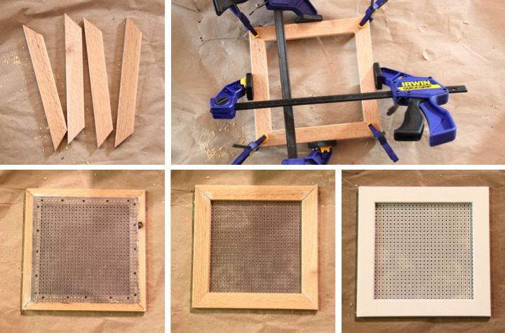
To make the vent cover I found some wood trim 3/8" thick and about 1-1/4" wide with slightly a slightly rounded edge to make the frame. I thought about using some craft wood to make a wood lattice but when I saw this metal with perforated holes resembling a caning pattern I knew it would be perfect.

I mitered the corners of the wood trim, used wood glue to assemble it and then clamped it while it was drying. After the glue was set I cut a piece of the metal with some tin snips and then used 1/4" cut tacks to nail the metal to the back of the frame. After a coat of spray paint primer and two coats of my ceiling paint I hung the cover over my opening.

Having the gaping hole in my bathroom ceiling finally covered up makes me really happy and I am so glad that my bathroom is finally finished up. My goal was to complete everything in a month and by doing a little bit everyday I did it. After I get everything cleaned up I'll post some pictures of the whole room.

Has anyone else finished up a big project recently? Are you in the midst of doing some fun things around the house? I'd love to hear what you are up to to get me motivated for my next project.

If you are interested, check out the rest of my bathroom posts here: Bathroom Blog Posts